Samy azougagh
SELF ORDER KIOSK
Mc Donald's
UX Research & UI
2024
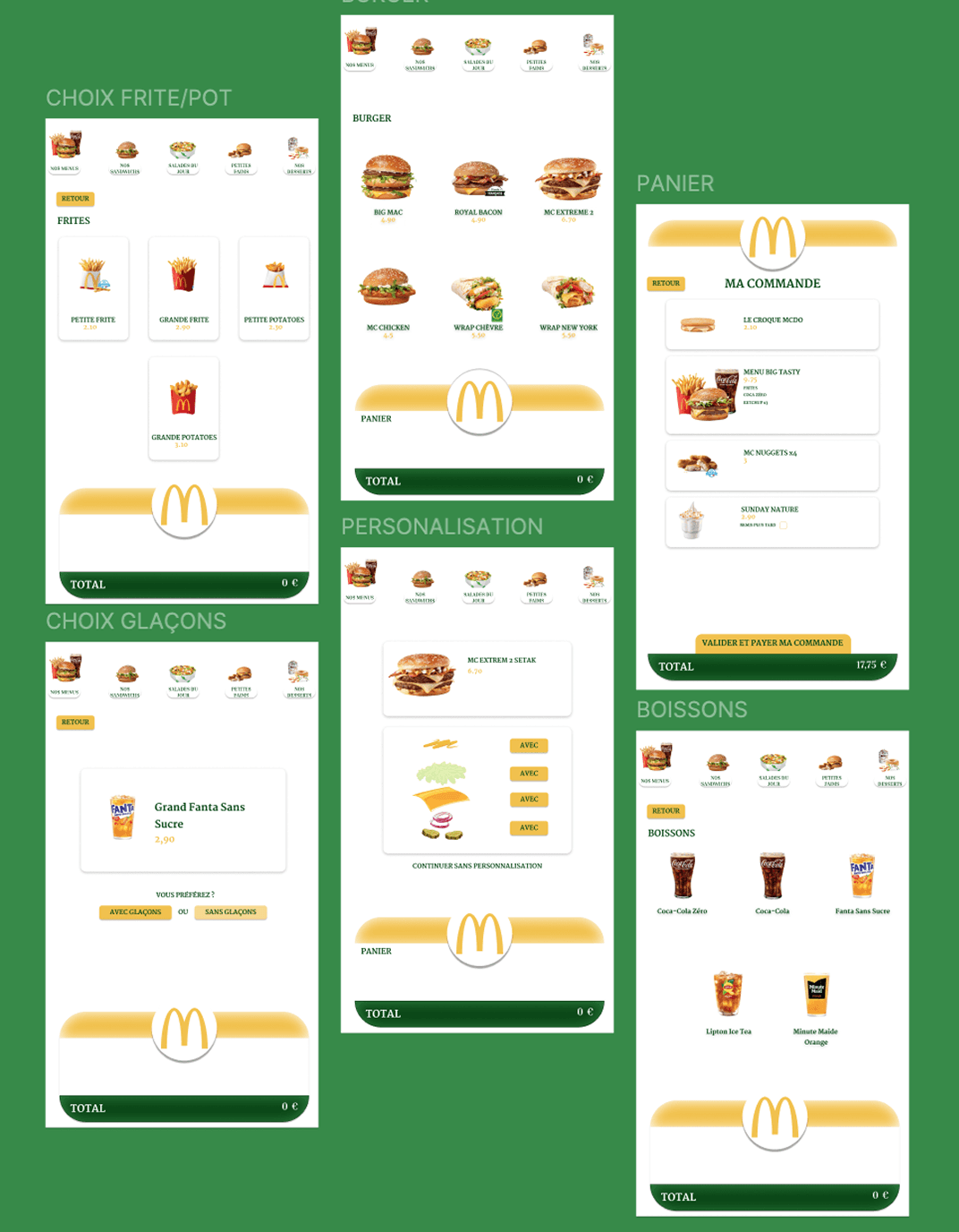
Refonte des interface de commande de chez Mc Donald's suis aux frictions et analyse comportamentales des utilisateurs
CONTEXTE
CONTEXTE
Ordering at McDonald's happens in seconds, under pressure, with a queue behind you. The kiosk has to be readable at a glance, noise, hunger and time all work against attention.
Ordering at McDonald's happens in seconds, under pressure, with a queue behind you. The kiosk has to be readable at a glance, noise, hunger and time all work against attention.
ENJEU
ENJEUX
ENJEU
Customization slows everyone down. The flow was rebuilt around a clear hierarchy of choices, so each step is decided at a glance and the pace of the queue is never broken.
Customization slows everyone down. The flow was rebuilt around a clear hierarchy of choices, so each step is decided at a glance and the pace of the queue is never broken.
UX STRATEGY & RESEARCH
WIREFRAMING LOW DIFELITY
(CRAZY 8 - STORY BOARD)
ARBORESCENCE
DESIGN SYSTEM
COMPONENT
RESPONSIVE DESIGN
PROTOTYPAGE
ANIMATION
UX STRATEGY & RESEARCH
WIREFRAMING LOW DIFELITY (CRAZY 8 - STORY BOARD)
ARBORESCENCE
DESIGN SYSTEM
COMPONENT
RESPONSIVE DESIGN
PROTOTYPAGE
ANIMATION
Comprendre avant de concevoir
recherche et stratégie
Avant de dessiner le moindre écran, j'ai voulu comprendre le vrai point de friction. J'ai mené des entretiens avec des patients, audité Doctolib, Maiia et Keldoc, et cartographié le parcours pour repérer où naissent le stress et l'attente.
Voir plus
Expandable note
CONCEPTION NUMÉRIQUE
Des wireframes au prototype, chaque écran a été pensé pour apaiser un patient déjà stressé. J'ai construit un design system complet, arborescence, composants, variants, au service d'une seule idée : rendre l'attente lisible et rassurante.
Voir plus
Résultat
Résultat
As part of my UX/UI certification, I analyzed the complete self-ordering journey to identify moments of friction, hesitation, and unnecessary complexity. I mapped the existing experience, questioned the logic behind each interaction, and explored ways to make navigation and decision-making more intuitive. The design process focused on balancing user needs, operational constraints, and the efficiency expected from a fast-food experience.
As part of my UX/UI certification, I analyzed the complete self-ordering journey to identify moments of friction, hesitation, and unnecessary complexity. I mapped the existing experience, questioned the logic behind each interaction, and explored ways to make navigation and decision-making more intuitive. The design process focused on balancing user needs, operational constraints, and the efficiency expected from a fast-food experience.


Comprendre avant de concevoir
RECHERCHE & STRATÉGIE
Avant de dessiner le moindre écran, j'ai voulu comprendre le vrai point de friction. Entretiens patients, audit de Doctolib, Maiia et Keldoc, cartographie du parcours, puis j'ai ouvert le champ des solutions au story-board et au Crazy 8 pour explorer sans me limiter.
Read more
CONCEVOIR POUR RASSURER
CONCEPTION & UI
Des wireframes au prototype, chaque écran a été pensé pour apaiser un patient déjà stressé. J'ai construit un design system complet, arborescence, composants, variants, au service d'une seule idée : rendre l'attente lisible et rassurante.
Voir plus
Résultat
Résultat
As part of my UX/UI certification, I analyzed the complete self-ordering journey to identify moments of friction, hesitation, and unnecessary complexity. I mapped the existing experience, questioned the logic behind each interaction, and explored ways to make navigation and decision-making more intuitive. The design process focused on balancing user needs, operational constraints, and the efficiency expected from a fast-food experience.
As part of my UX/UI certification, I analyzed the complete self-ordering journey to identify moments of friction, hesitation, and unnecessary complexity. I mapped the existing experience, questioned the logic behind each interaction, and explored ways to make navigation and decision-making more intuitive. The design process focused on balancing user needs, operational constraints, and the efficiency expected from a fast-food experience.
Samy azougagh
© 2026 SAMY AZOUGAGH
© 2026 SAMY AZOUGAGH